the benjamin reno
In this month’s blog post I am going to take you through the most recent design project I worked on, let’s take you on the design journey from before photos right through to the finished product.
the project
The aim of this project was to refresh my clients 17 year old home, by updating it to their current tastes, while lightening the space and catering to the needs of their family. This design involved updating the timber flooring throughout the main floor, new carpet to all bedrooms, adding plantation shutters to all windows in the home and repainting the walls from cream to fresh, crisp white. From there the two spaces to be nearly completely refurnished is the family room adjoining the kitchen and meals area, as well as the large living room.
the brief
My client loves blue and white and usually loves a Hamptons aesthetic, BUT, an underlying interest was exploring black and tan modern farmhouse features throughout the living room, while still tying into their love of blue which would be more featured in the family room.
These spaces needed to be practical for their family, ensuring everything would be hard wearing, easy clean and suit the traffic flow of their family.
We also had existing items to include in the design such as artwork and unique décor with personal value to the clients.
family room
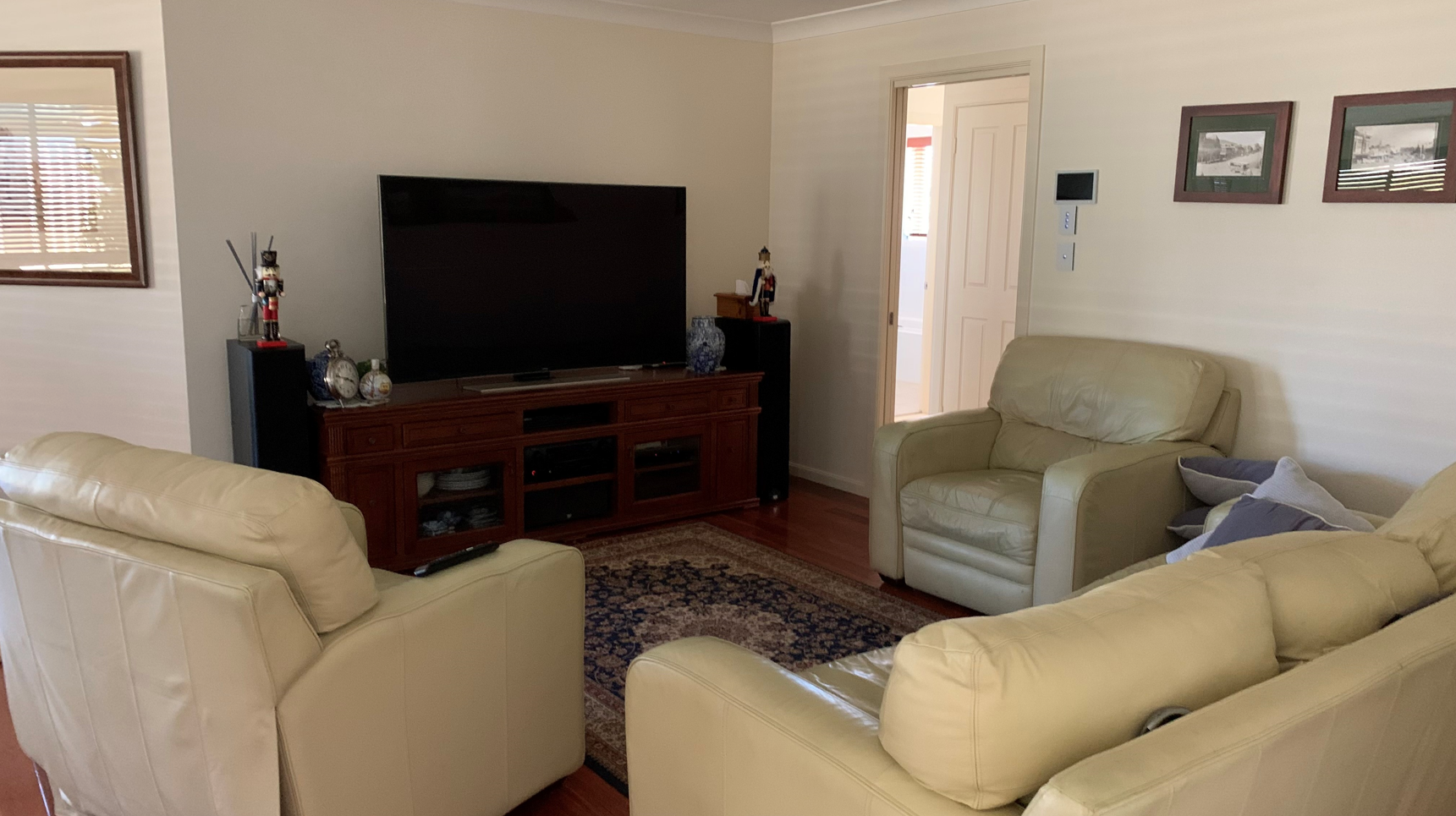
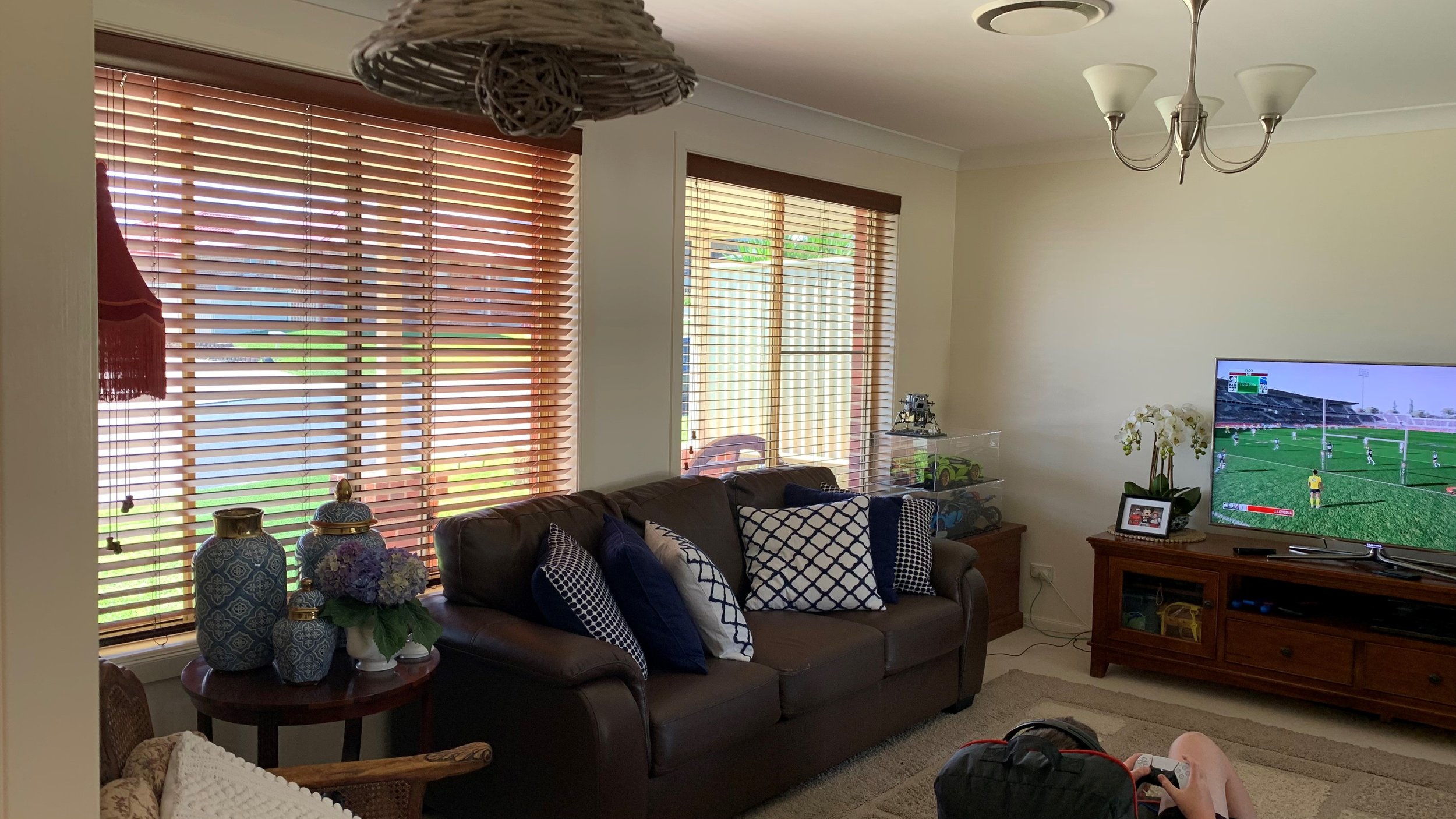
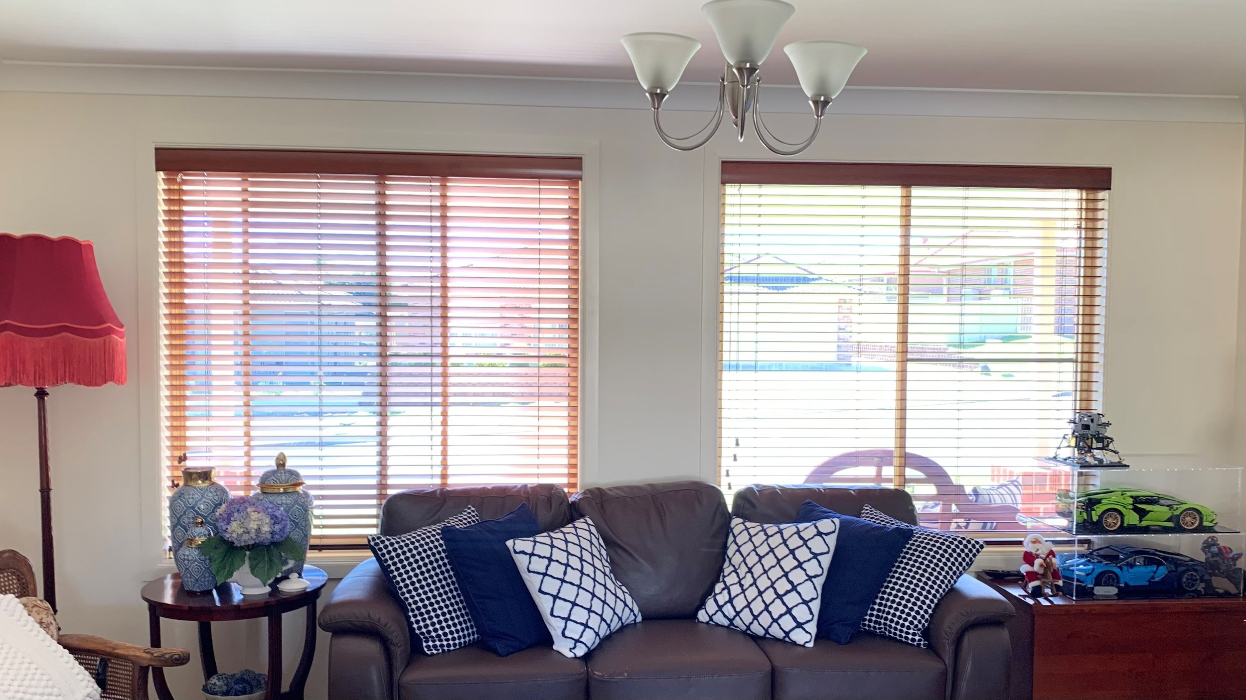
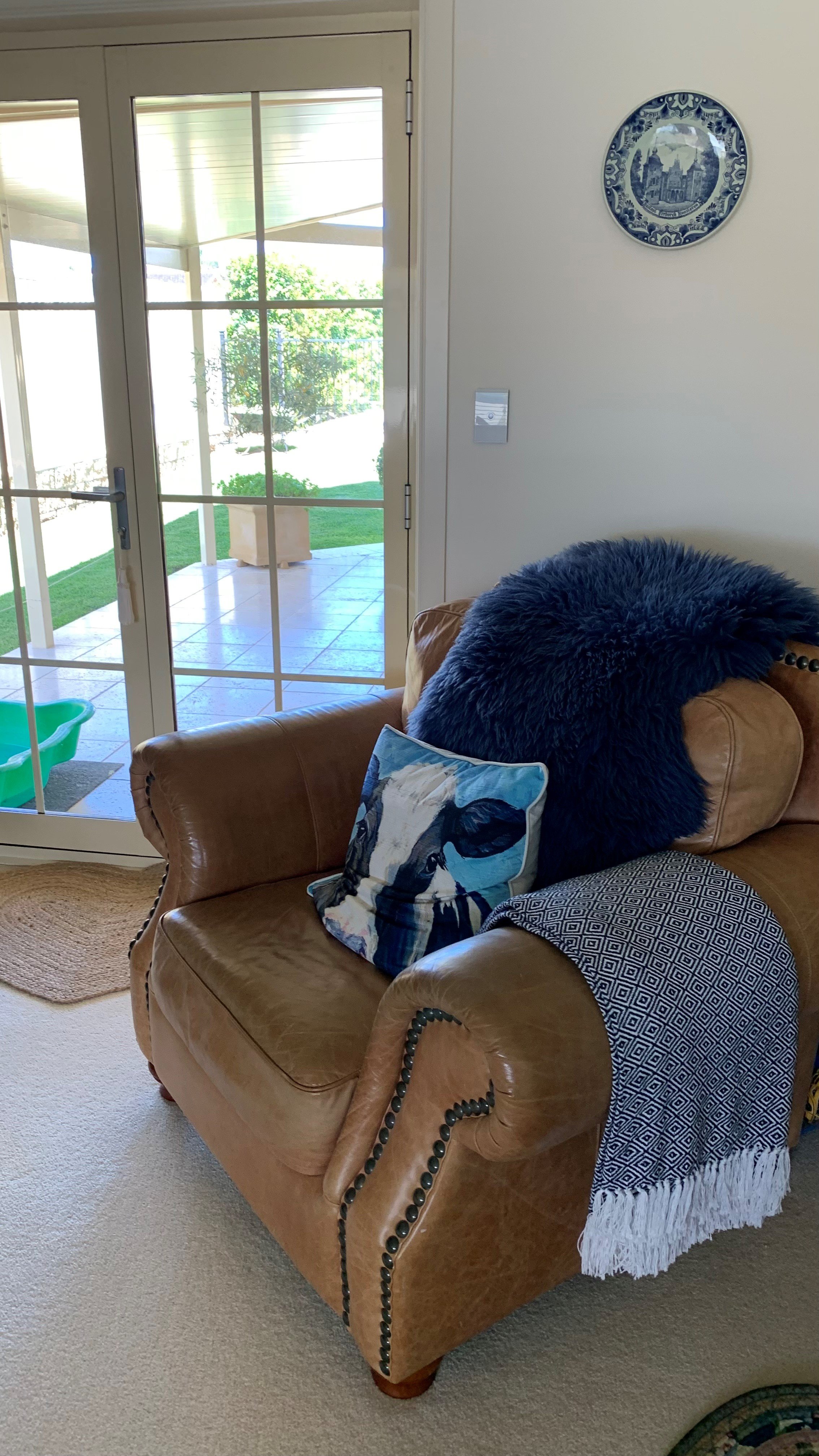
BEFORE
This space was no longer suiting my clients needs - function or aesthetic.
What we needed to work on in this space:
selecting furniture that would fit better in the space, making the space more open
adding my clients style and personality into this space by changing the colour scheme
Select wall hanging to create the aesthetic my client would like to see through their home

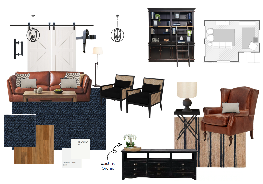
THE DIRECTION FOR THIS SPACE
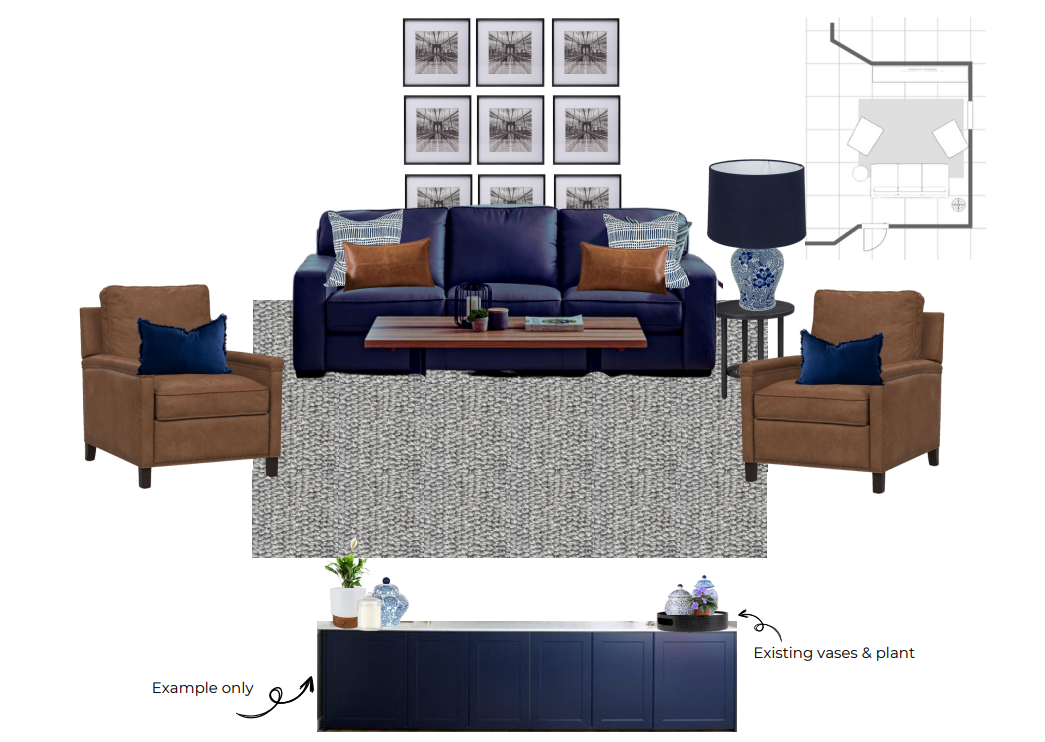
This is the mood board that we went with for the family room, this guided the direction for the design and the colour scheme we would go ahead with.
We did explore what colour the main lounge would be, do we go light and accent with a tan chair or do we go bold with blue?
My client loved the idea of bold blue, but also loved the tan that was coming through in the design for the living room (which you will see soon).
FINALISING THE DESIGN
Our final design is more formal than intended, although it really suited my clients aesthetic. This design encompasses the client’s traditional design aesthetic, including their love for Hamptons and blue, all while complimenting the modern farmhouse style that is heavier presented in the living room.
We selected all leather lounges and softened the look with large cushions and a soft wool rug.
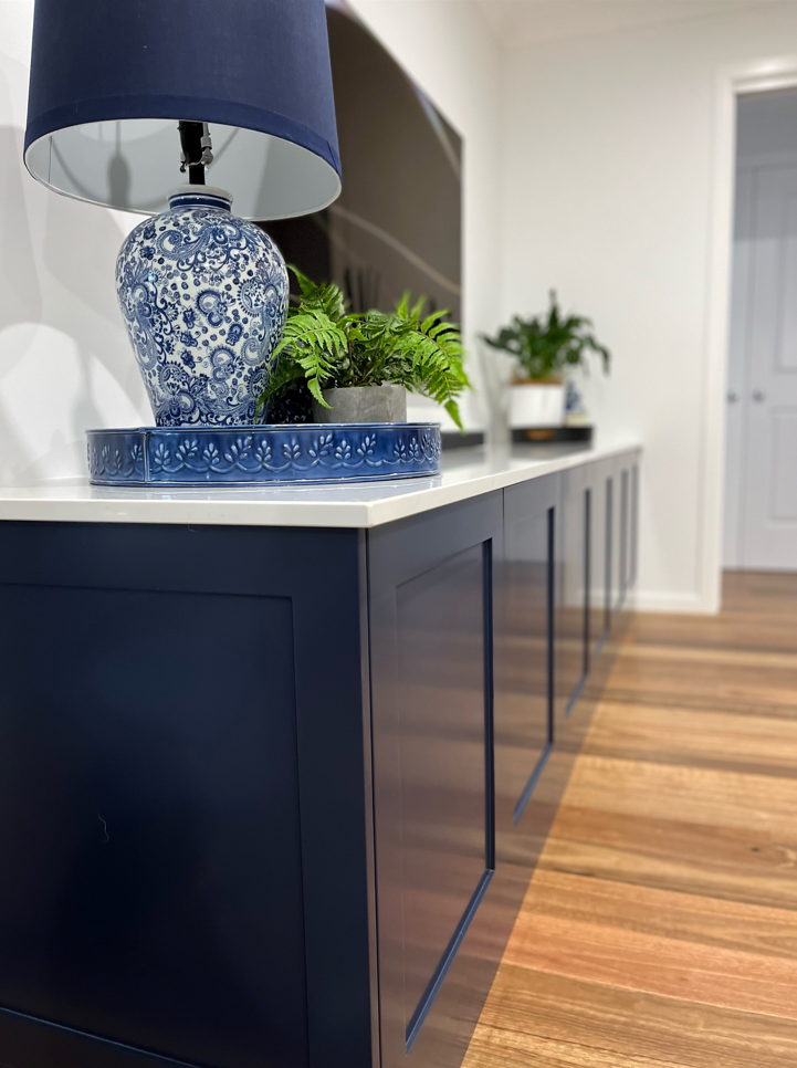
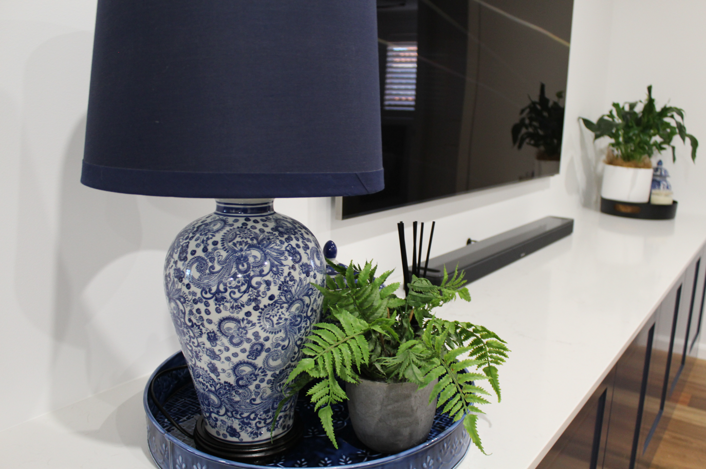
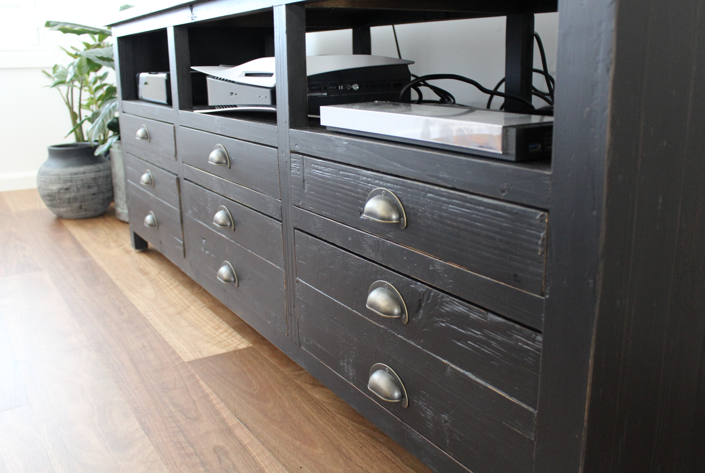
Originally we were including the original tv unit and designing to compliment it, however my client fell in-love with an inspiration picture I found which happened to have a gorgeous blue shaker TV unit in the image… so, we explored a custom TV unit.
the final look

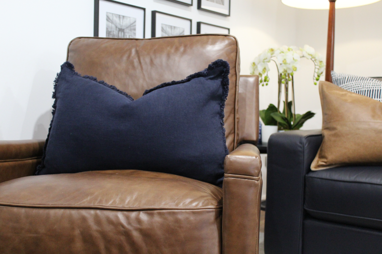
The family room turned out beautiful! We went for a rather symmetrical look with the two armchairs (btw they recline and look great!) paired either side of this dark navy blue lounge. The great thing about this space is we didn’t lose any seating space by selecting more narrow armed furniture, with overall sizes that better suit the space.
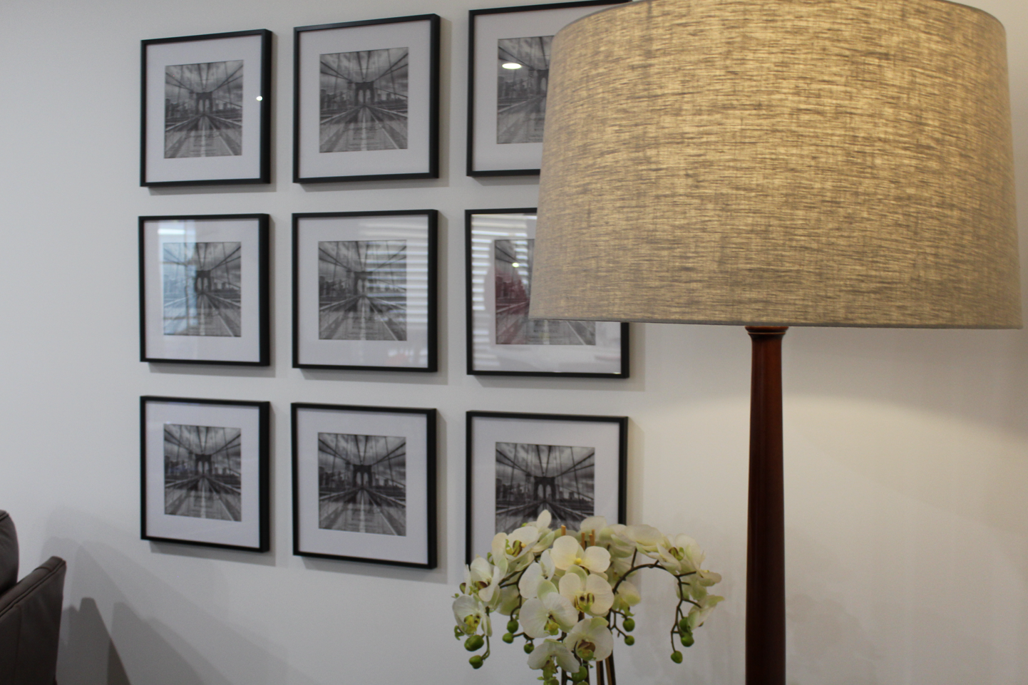
I included a gallery wall to fill the wall, while still leaving negative space for an open aesthetic. To tie in the two lounges and the very different colours, I included navy cushions on the tan chairs and tan cushions paired with patterned blue cushions on the navy lounge. To keep the existing floor lamp we replaced the lamp shade ,which is massive! but it looks great and added necessary height to the space.
The grey wool Bremworth rug, is so gorgeous, great quality and a perfect colour for the space, the large size grounds the lounge room and assisted the space appear larger and more open.

The custom TV unit, worked an absolute treat in this space. As it was made to fill the entire length of the wall it has really enlarged the look of the lounge room and complimented the sizing of the furniture, while allowing us space to style either side of the tv.
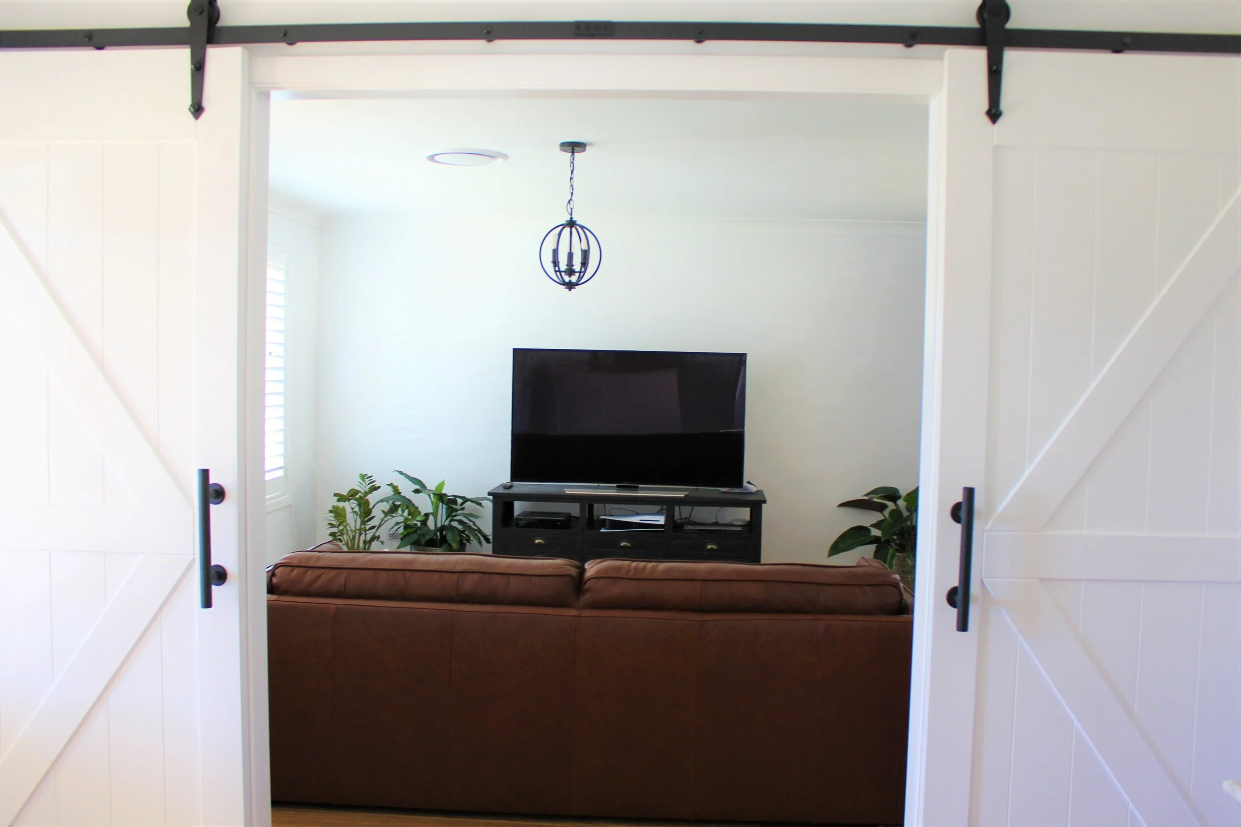
living room
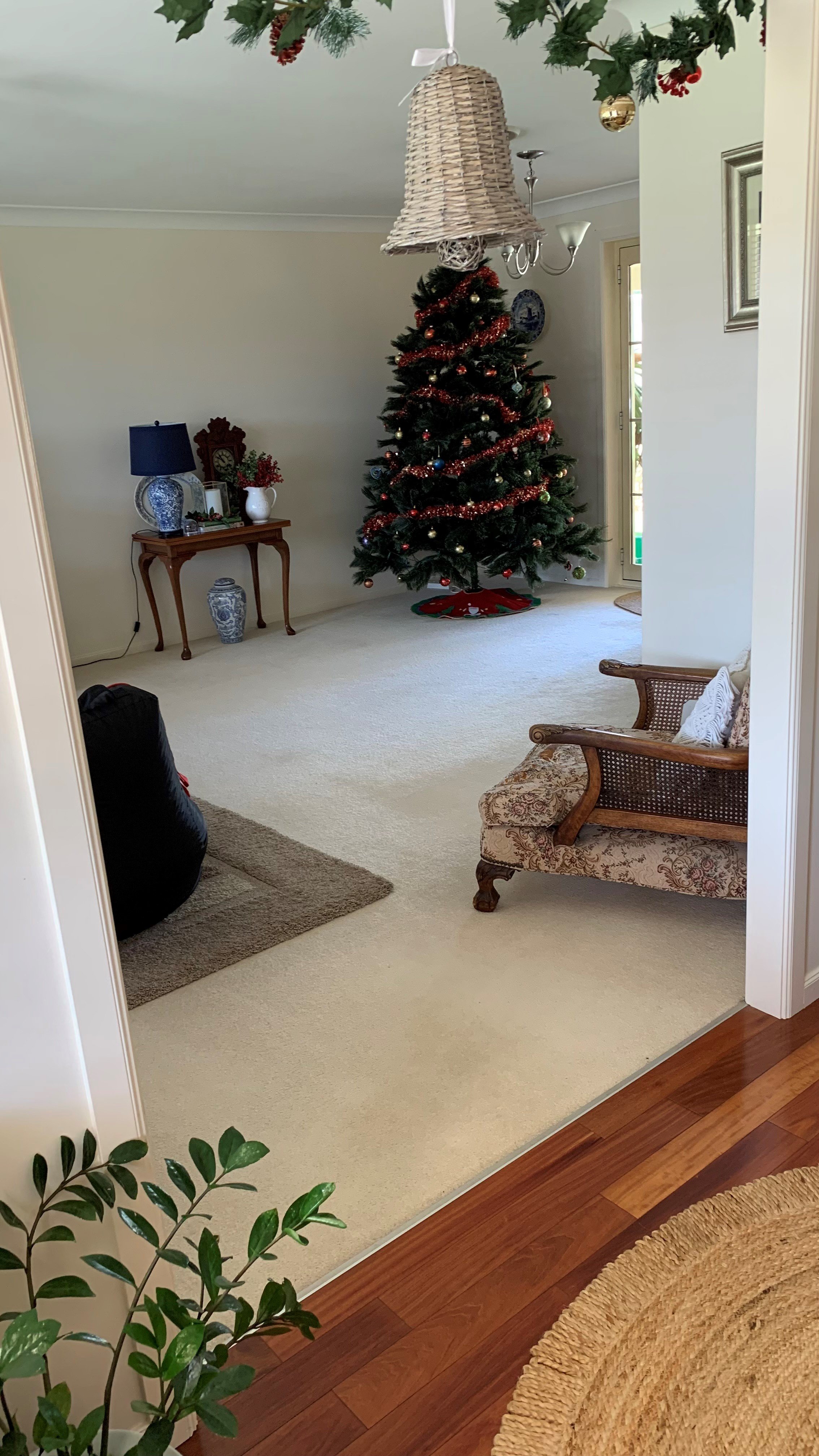
BEFORE
This space was quite bare and used mainly for the teenagers to play Xbox and socialise with friends. BUT, we had big plans for this space. My client was intrigued to try out a scheme that didn’t match their usual aesthetic and have fun with a colour scheme that stood out to them.

THE DIRECTION FOR THIS SPACE
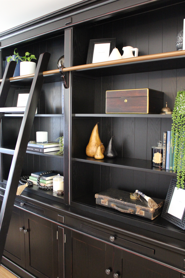
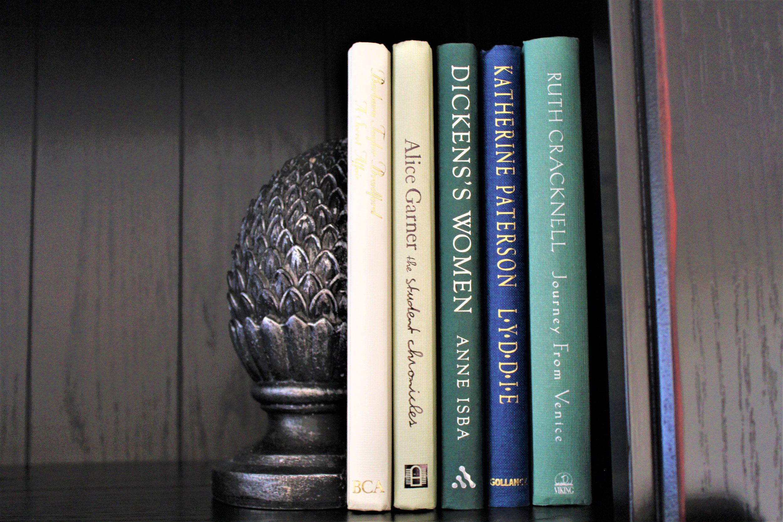
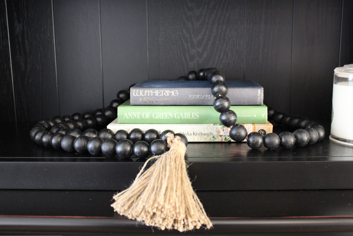
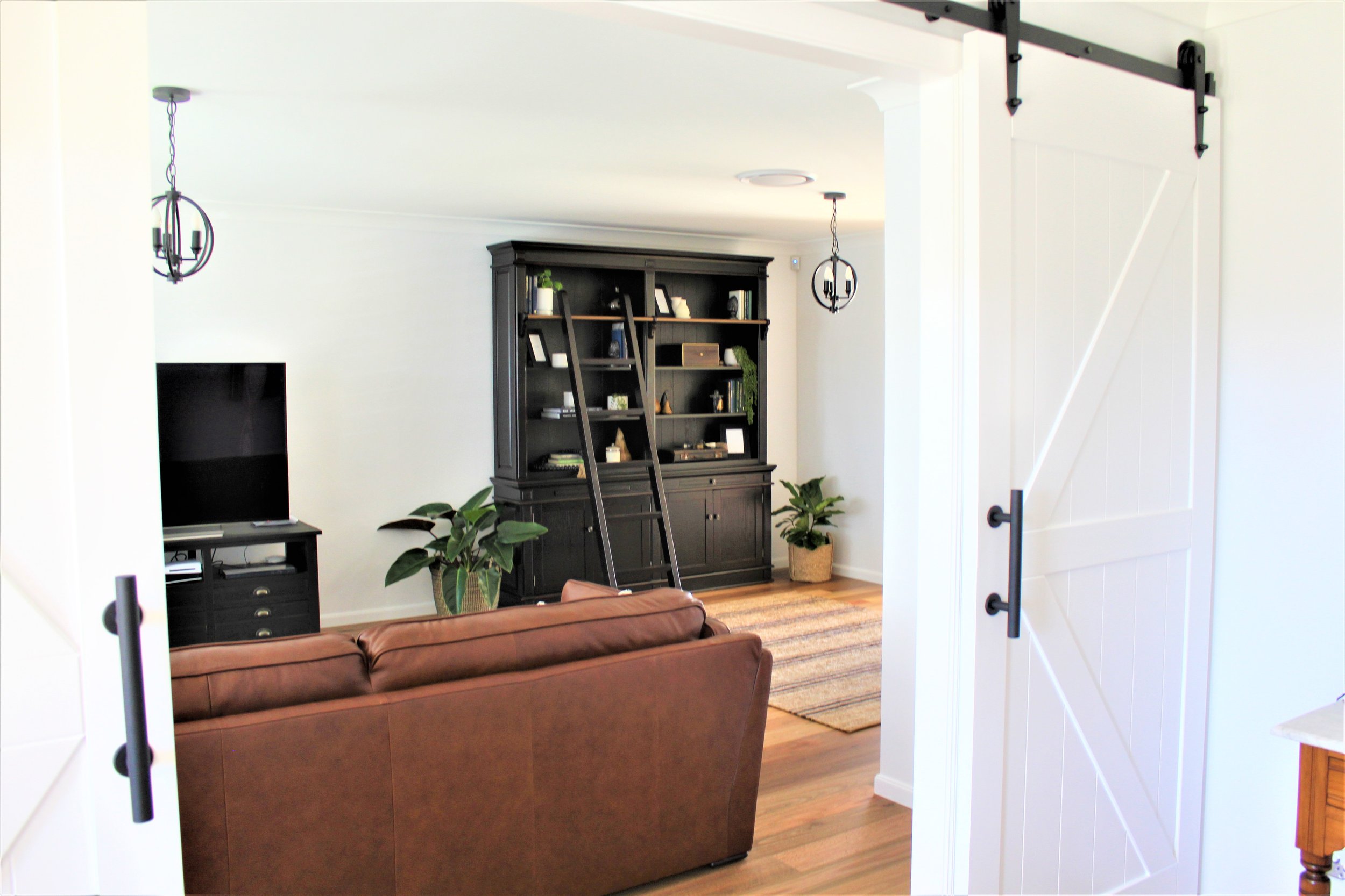
For this space, we wanted to really focus on the modern farmhouse aesthetic, including barn doors as the feature entry to the space (which is shared with the front entry), tan leather and black features. One of the main features was also going to be a gorgeous library. We also needed to include a little bit of blue to tie in with the family room.
FINALISING THE DESIGN
Our final design played with textures, shape and colour.
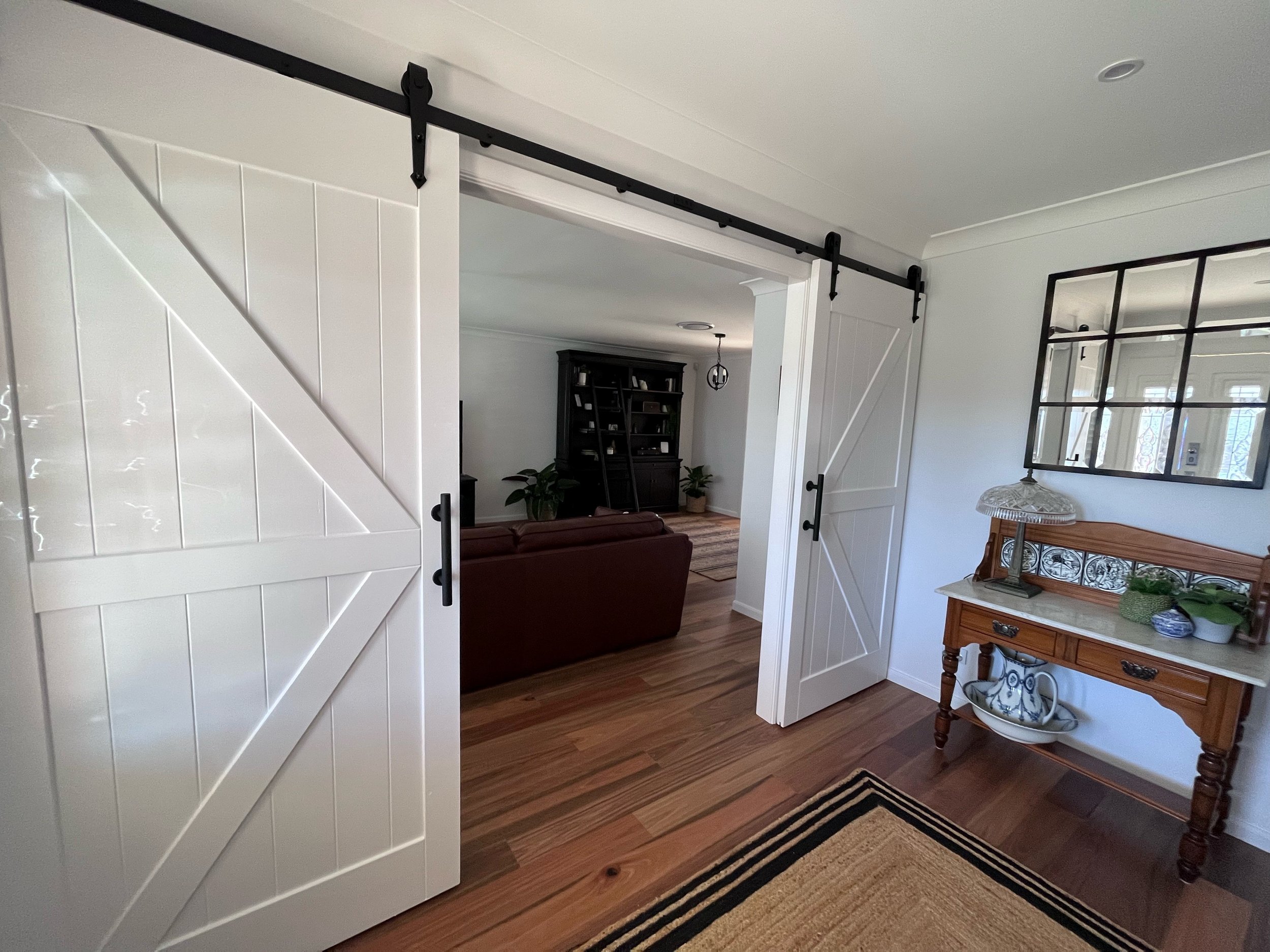
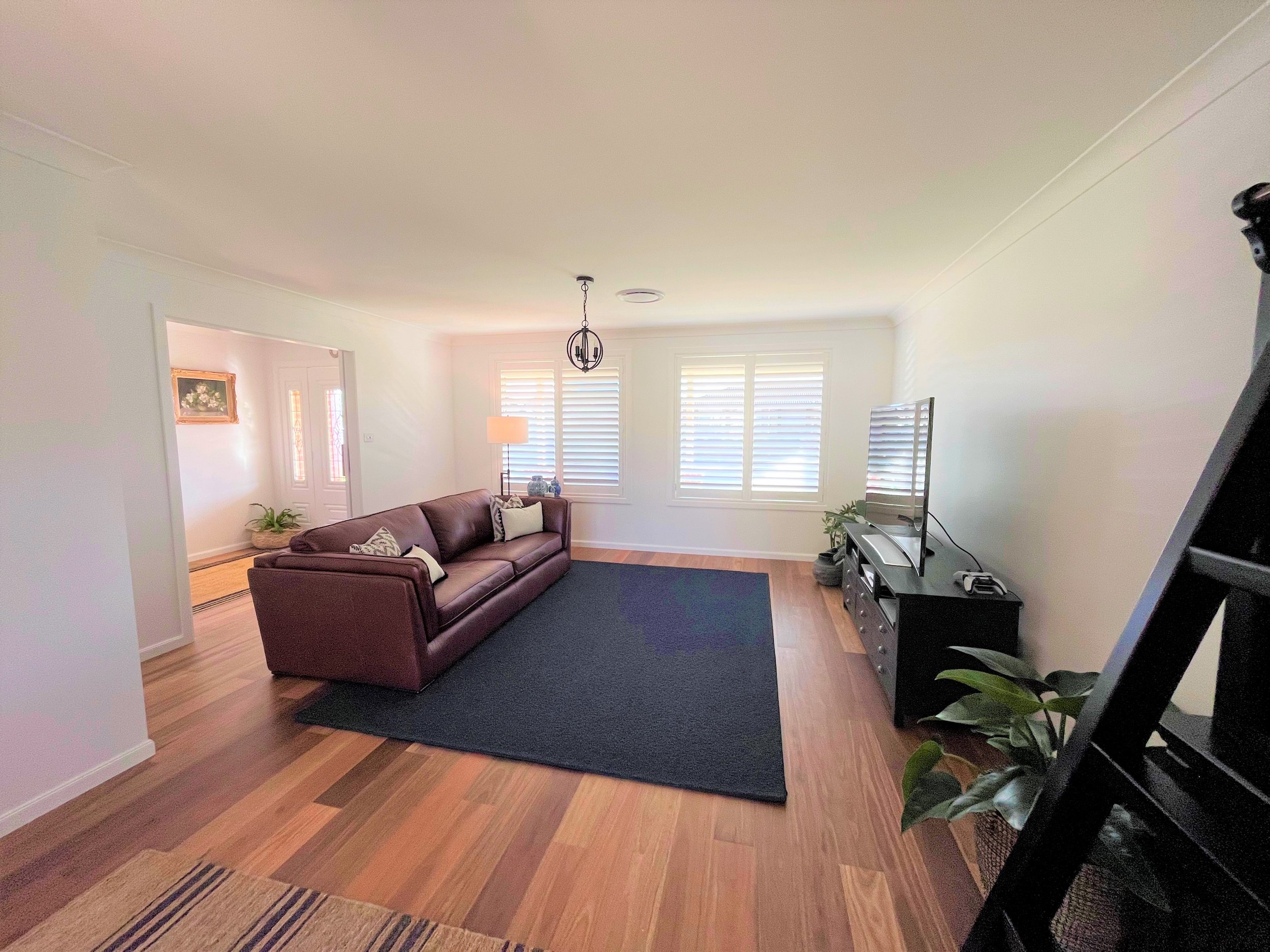
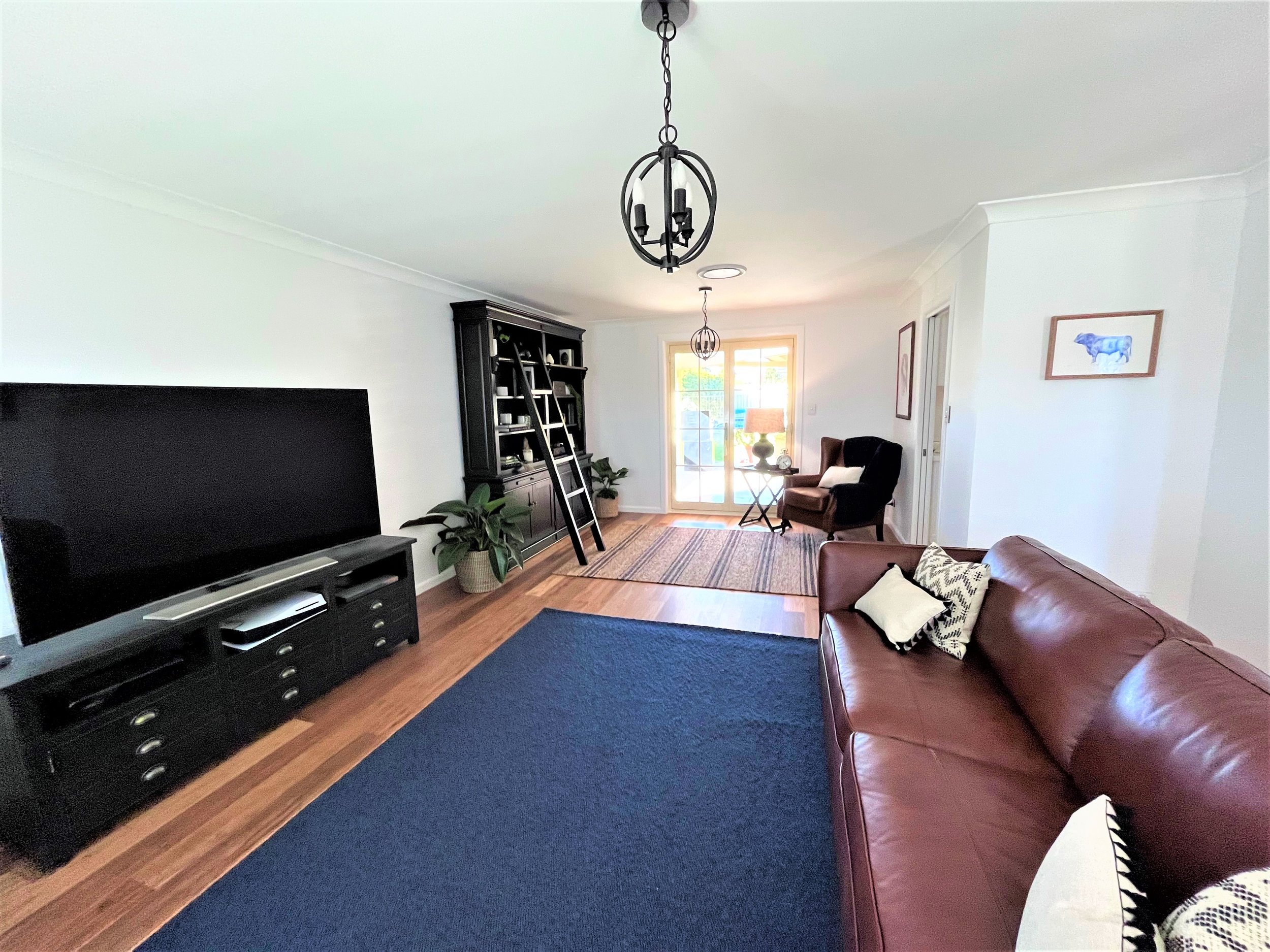
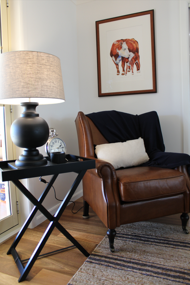
This space was a winner from the beginning with no revision of the concept design. We created two spaces out of this large living room, having the lounge area at the front and a reading nook with library closer to the kitchen.
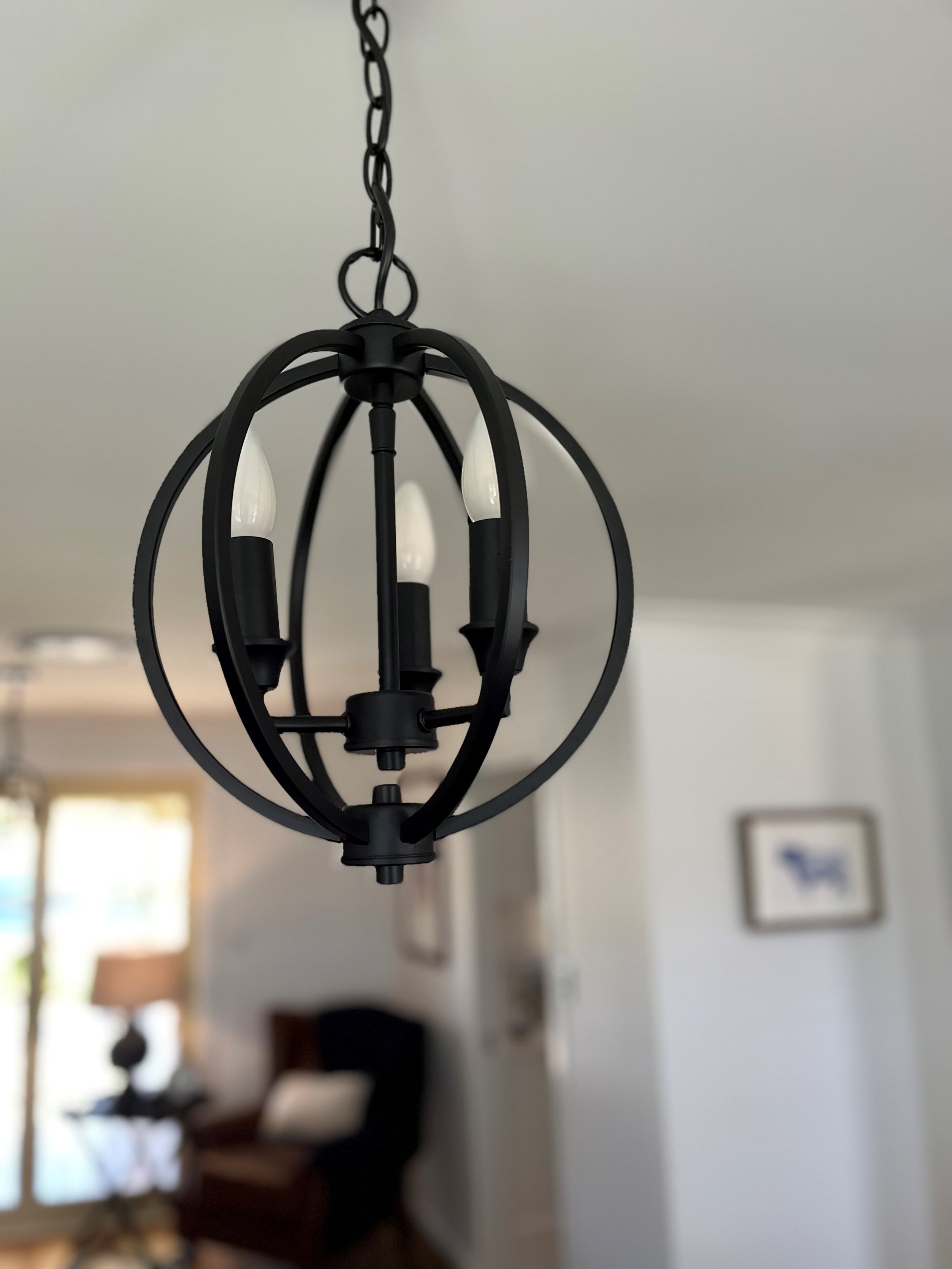
As there was plenty of leather in the design for both spaces, we softened the look with another wool Bremworth rug, rattan armchairs and a jute rug from Armadillo and co. My client likes to use dim lighting in the evenings, which made multiple lighting options a consideration, resulting in lighting for each area.
This space previously was carpeted, we opted for the new timber flooring to flow through to this space, creating a more formal look, contrasting with the dark furniture and it has really opened up the space!
The final look
This space came together really nicely, we are still waiting for the rattan armchairs to arrive - so keep an eye out for an update! The two spaces work so nicely as one, flowing from the area that will often be used by my clients children to the area with my clients beloved items displayed beautifully in their new library and gorgeous reading nook.
We freshened up the entry way with a new mirror and hallway runner, as well as the barn doors! My favourite detail about these doors is the track I selected, with the arrow shaped details.
The new plantation shutters from Decorama Tamworth have added a clean and crisp aspect to the space, while adding character to the design.
This design was so much fun to work on, my clients were an absolute treat to work with and the final product came up so nicely! This really was the perfect project, working with the Benjamin’s was amazing, all ideas and concepts flowed so well and we could bounce off each other to get the perfect design created.